Redesigning Core Experiences for ss.ge - Georgia’s Leading Marketplace
Role: Product DesignerTimeframe: 2022
Live Product: ss.geScope: End-to-end redesign of Georgia’s most-used online marketplace (real estate)Responsibilities: Research, UX strategy, UI design, stakeholder communication, and delivery
Team: Worked alongside a product designer, cross-functional developers, and business stakeholders
In 2022, I was invited to redesign ss.ge, Georgia’s most widely used online marketplace, a platform with millions of monthly users across real estate, automotive, jobs, and consumer goods. The challenge was clear: while ss.ge had strong market dominance, the product experience hadn’t kept pace with user expectations. Key journeys like search, filtering, and browsing were confusing and inconsistent, especially on mobile where most traffic occurred.
My role was to own the redesign end-to-end: from research and UX strategy to visual design and stakeholder communication.


ss.ge
Understanding the Challenge
ss.ge dominated the Georgian market, but its product experience lagged behind modern marketplace standards. With millions of monthly users, most on mobile, confusing navigation, cluttered filters, and inconsistent design created friction in the platform’s most critical journeys.
Challenges
- Navigation & filters: Complex, inconsistent, and difficult to use on mobile.
- UI clutter: Listing cards buried key information, making comparisons slow.
- Fragmentation: No cross-platform consistency between desktop and mobile.
Actions
- Conducted a full UX audit of web and mobile to identify friction points.
- Benchmarked against global leaders to define modern expectations.
- Gathered user and stakeholder insights, combining research with my own frequent-user perspective.
- Framed problems clearly to stakeholders, aligning everyone on priorities before design began.
Impact
- Stakeholders saw a clear articulation of product pain points and how design could resolve them.
- Moved from fixing pixels to shaping priorities, building trust, alignment, and a stronger partnership with engineering.
Before
After
Redesigning Core Journeys
The goal was not just a visual refresh, but to simplify and modernize the core journeys that mattered most: search, filtering, listing cards, and mobile-first browsing.
Challenges
- Search and filtering flows were slow and not optimized for mobile.
- Key details like price and location weren’t visible upfront, making listings hard to compare.
- Desktop and mobile offered inconsistent, fragmented experiences.
Actions
- Search & Filtering: Rebuilt the filtering experience to be faster, intuitive, and optimized for mobile.
- Listing Cards: Surfaced essential info (image, price, location) upfront for quick scanning and comparison.
- Design System: Established a unified system of reusable components and visual styles across desktop and mobile.
- Mobile-first Flows: Prioritized the highest-traffic scenarios, ensuring search and browsing could be done in fewer steps.
Impact
- Navigation efficiency improved, with 25% fewer steps-to-result.
- Users found items faster and with fewer errors.
- Stakeholders noted the platform felt modern, simplified, and internationally competitive.
Before
After
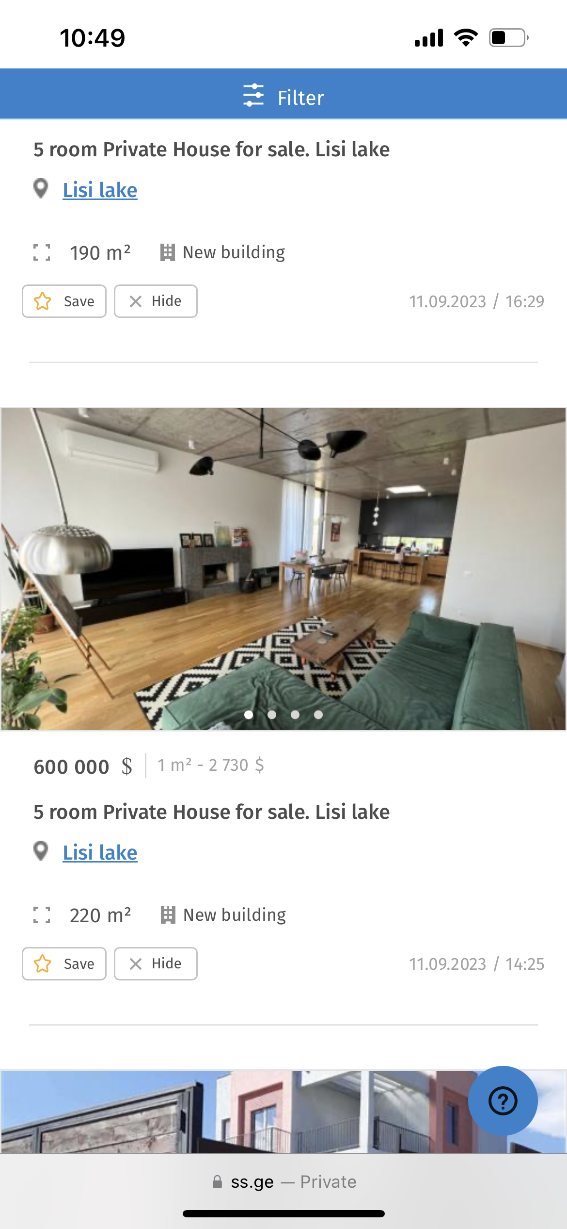
Duplicated properties
In Georgia, it is common for multiple agencies to simultaneously sell or rent the same properties. While the property details and image materials provided are the same, the agencies may offer different prices. This can create confusion for users when filtering properties and encountering the same listing or visuals on multiple pages.
To tackle this issue, I have opted to consolidate all identical properties into a single card. Users can click on the card to view a comprehensive list of individuals who have listed the same property, along with their respective prices. This streamlines the task of identifying variations and assists users in determining whom to reach out to for further information.
Card anatomy
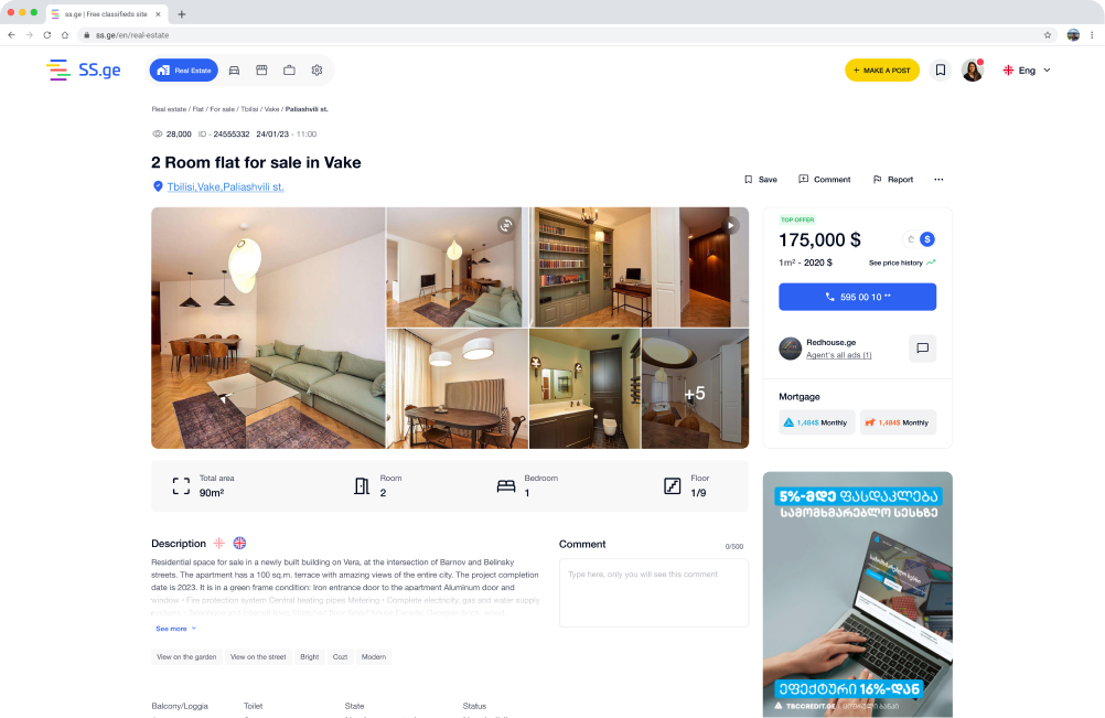
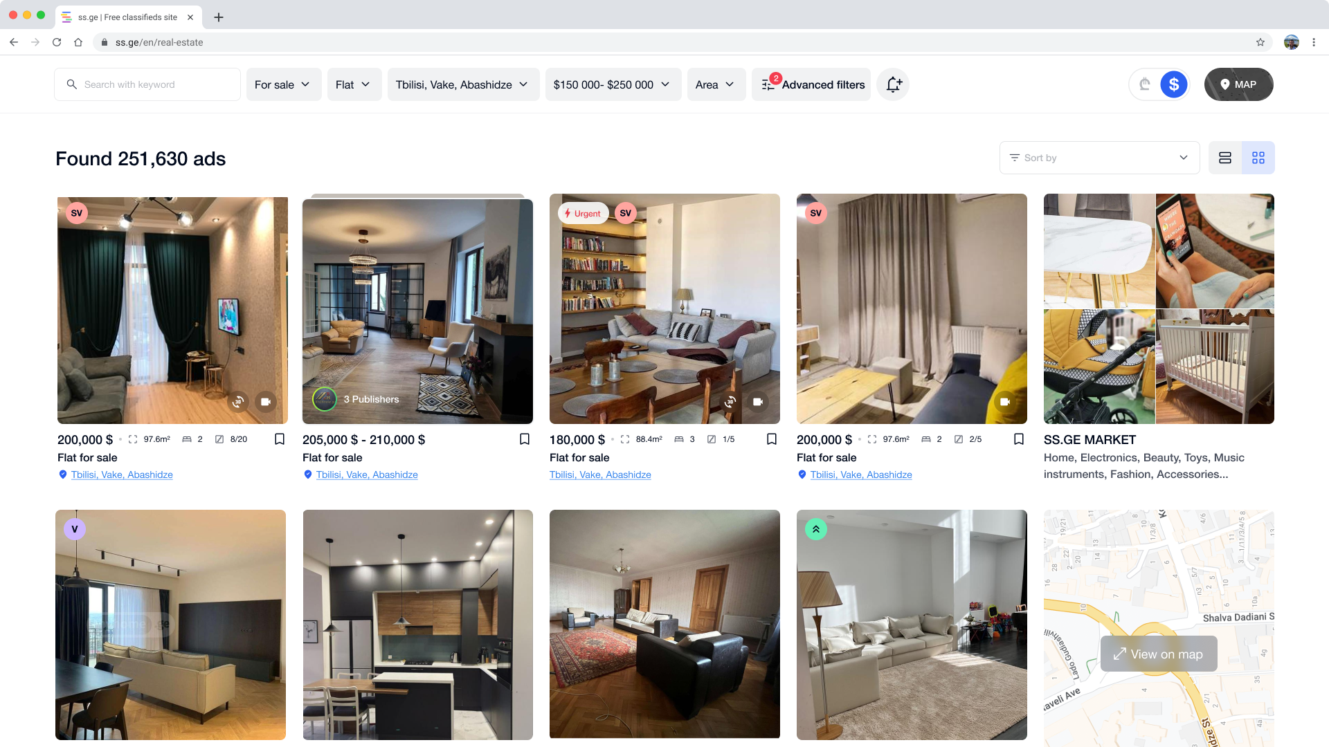
I believe cards are one of the essential components of listing sites. Therefore, improving the card anatomy to better meet users' needs and optimize it for mobile devices was one of the biggest challenges.
The previous layout struggled with readability and hierarchy: key details like price, size, and location were visually crowded, and interactive elements such as save or hide were secondary in the flow. On mobile, these issues became even more pronounced, making scanning and comparing listings difficult.
The redesigned version introduces a clearer visual rhythm and simplified information structure. I prioritized the most critical data points (price, size, and location) and refined spacing to create balance. Icons replaced text where possible, and the interaction buttons were repositioned for easier thumb access on mobile.
Overall, the update made cards feel lighter, more scannable, and visually aligned with the rest of the system, improving both usability and consistency across devices.
After
Before
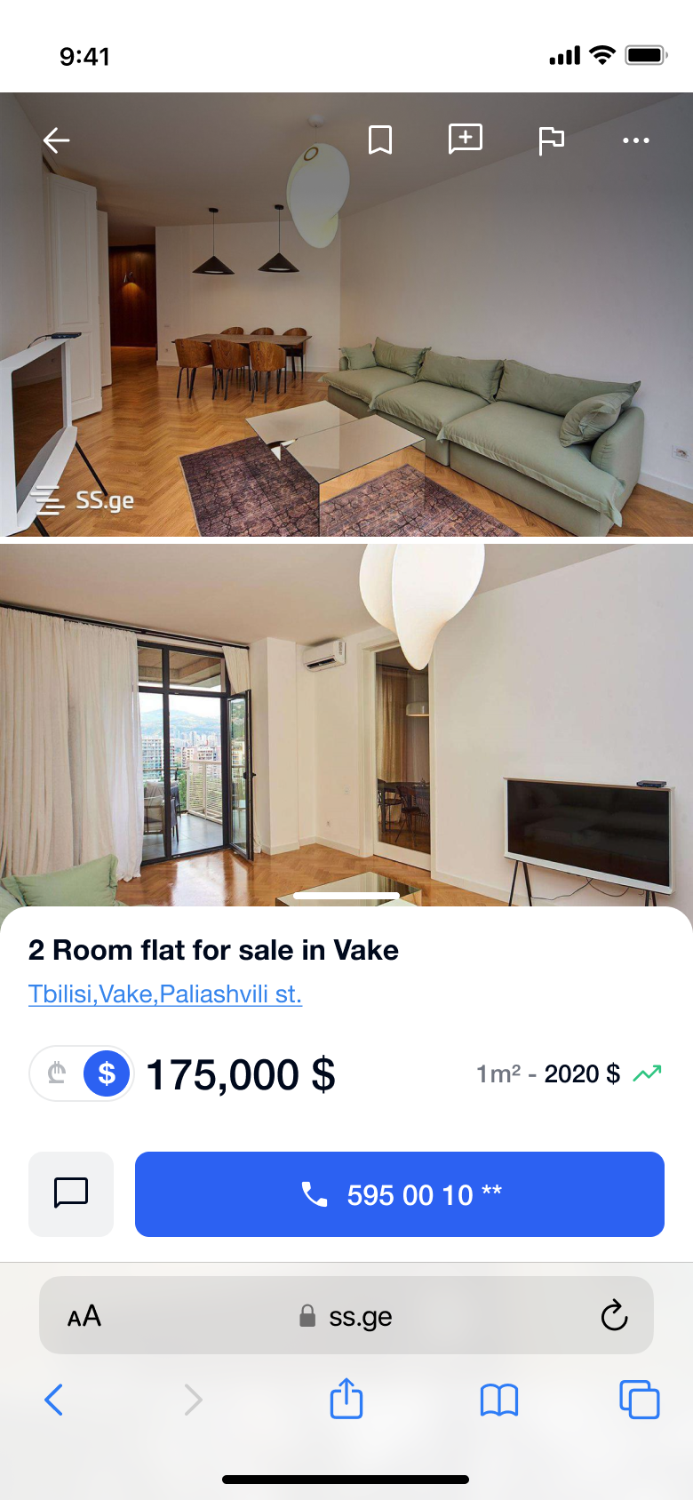
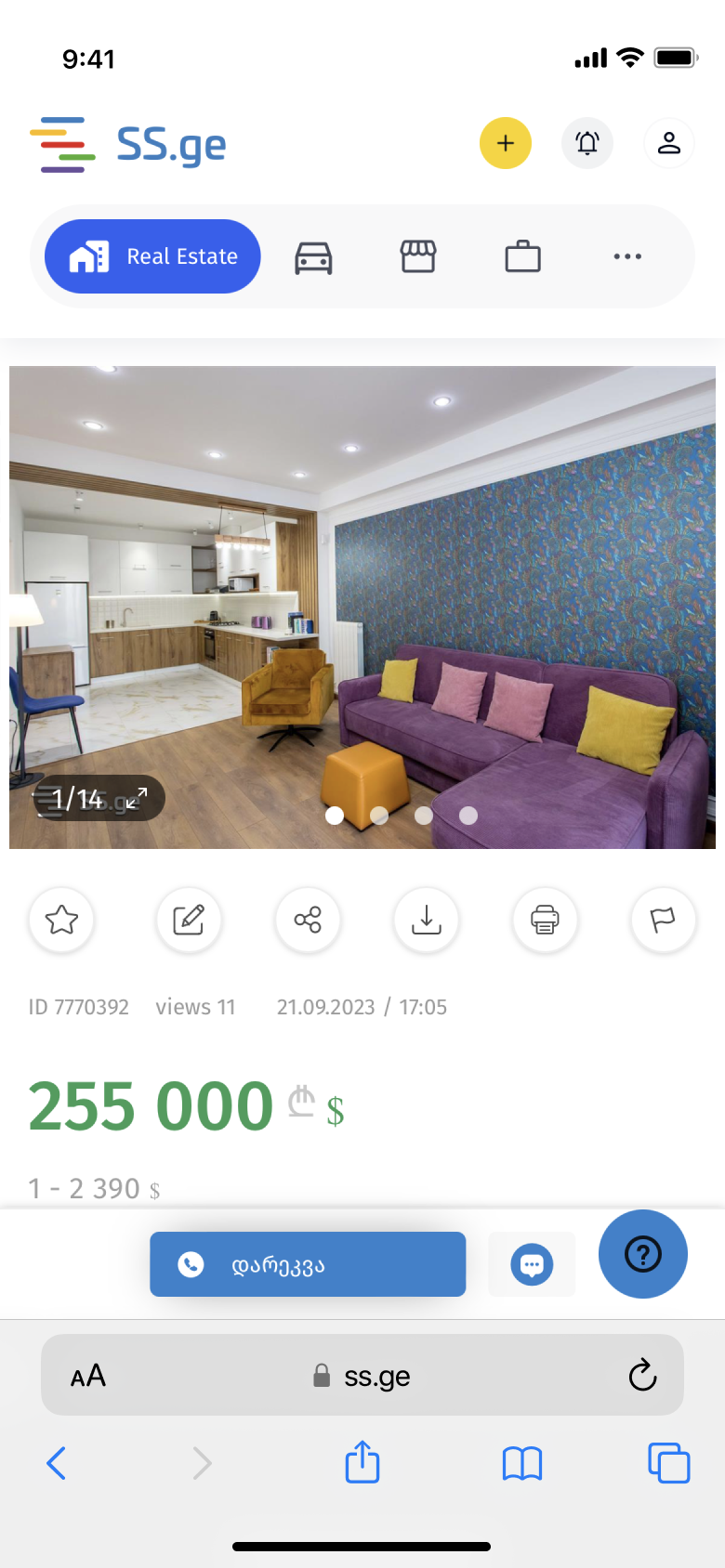
Mobile experience
Improved hierarchy
The property details page suffered most from a lack of visual hierarchy. Core information was difficult to scan, as users were met with an unstructured layout filled with secondary or irrelevant details. The primary action was also underemphasized, making it easy to miss.
To address this, I restructured the layout to guide attention toward the most important content and introduced a clear visual rhythm. The main CTA, contacting the seller, was moved to the right side and given stronger visual weight, while the secondary option (in-platform messaging, rarely used by most users) was visually de-prioritized.
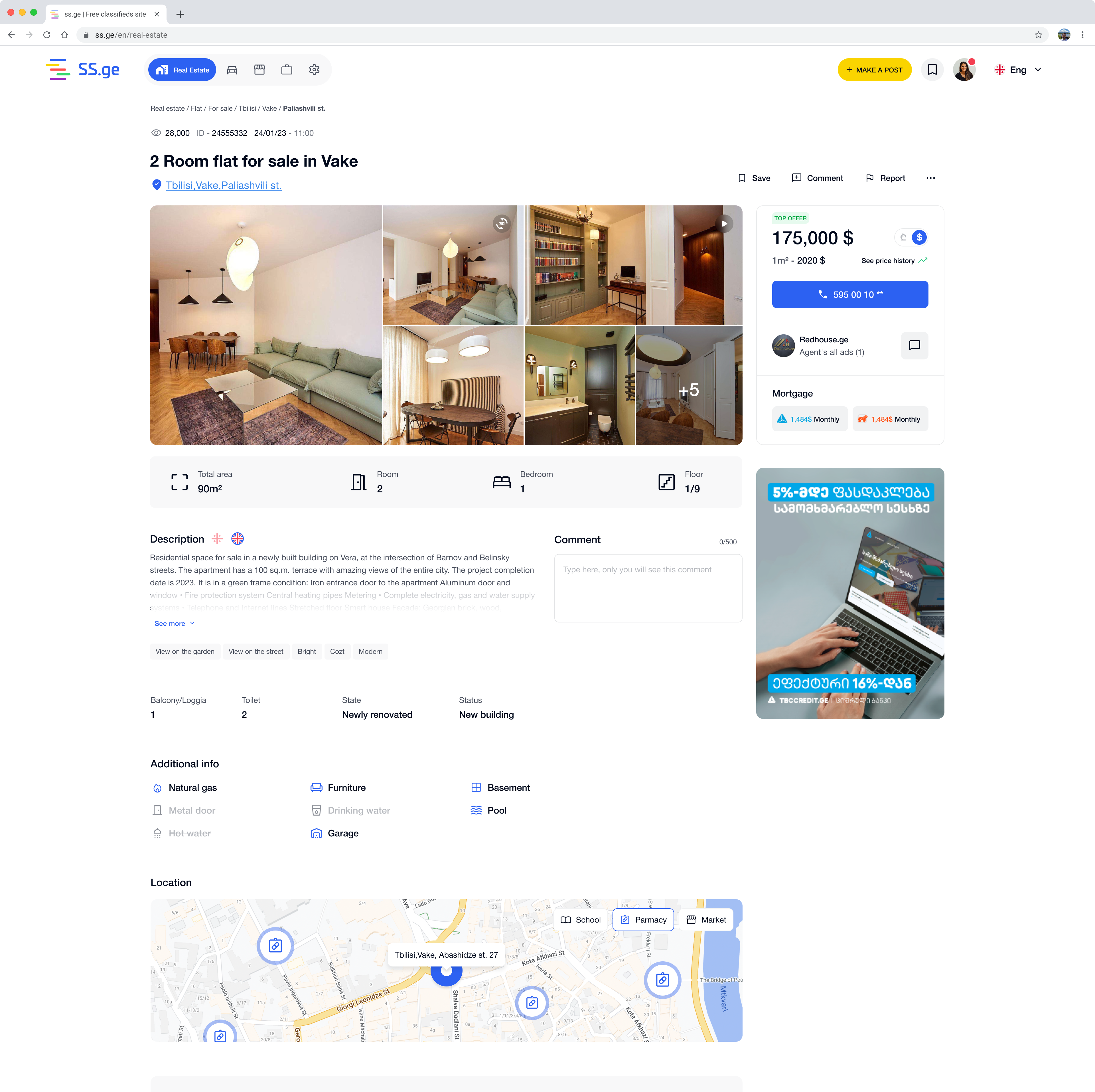
Before
After
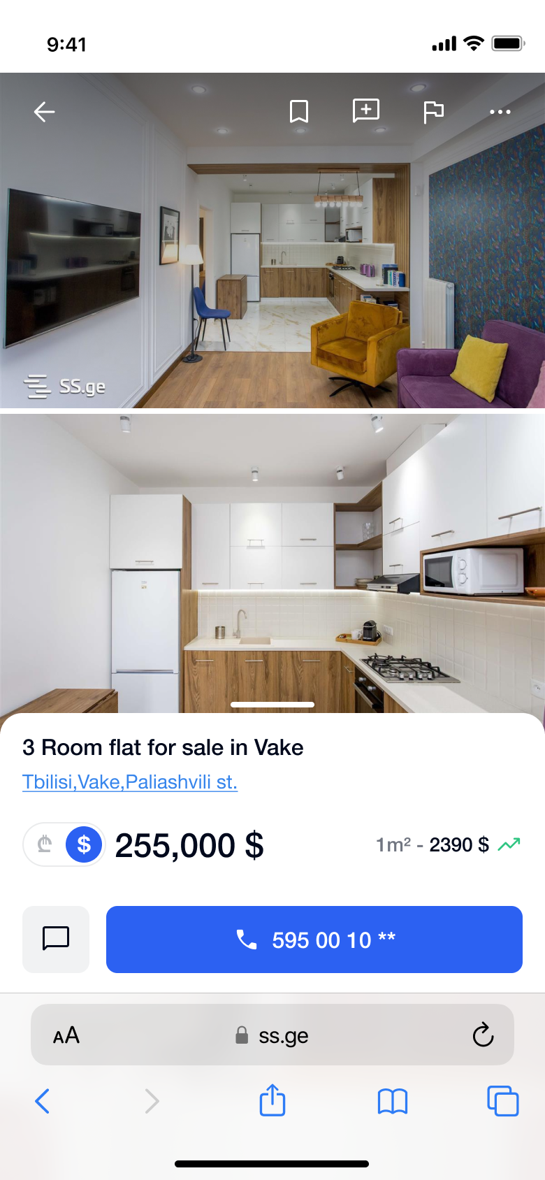
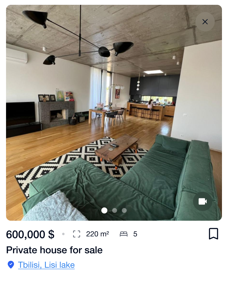
Property images
One of the biggest challenges I faced was redesigning the image gallery while considering that most users were uploading mobile images, primarily in portrait mode.
To address this, I decided to position the gallery as a background layer that would proportionally fit both portrait and landscape modes without cropping them, allowing for vertical scroll. Meanwhile, the main information would be displayed as an overlay using a bottom sheet modal.

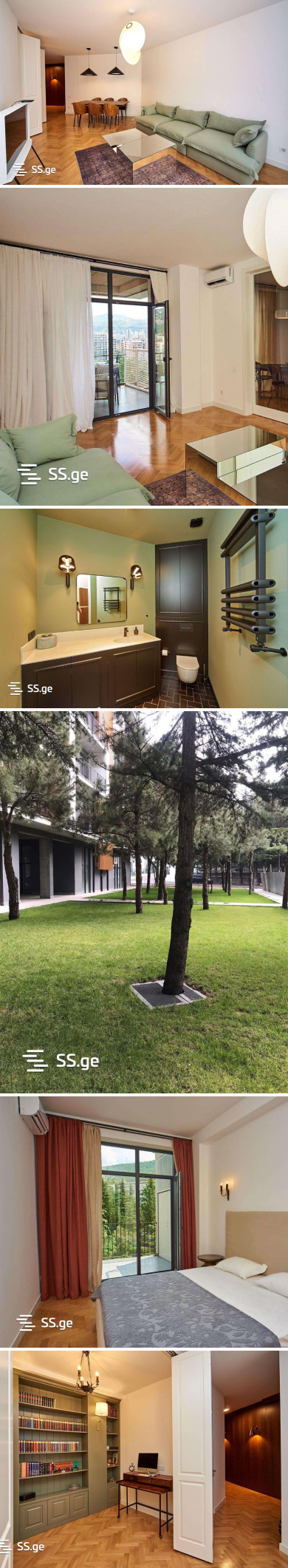
Keeping the image
proportions unchanged
Non-approved Concepts
When working on a product that caters to different types of users, it can be challenging for the client to make drastic changes that would require significant effort from users to learn new things and for the brand to educate them. Moreover, there is no guarantee of success in the end. Still, I wanted to explore what could be possible, so I’m sharing a few alternative concepts that weren’t approved but reimagine key parts of the experience.
Interactive breadcrumbs
Seamless search experience


·
·
·
Reflections
ss.ge was a valuable project that strengthened my confidence in leading complex redesigns independently. I took ownership of research, strategy, and delivery, collaborating closely with engineering to shape direction and ensure a scalable foundation for future growth.
My focus was on simplifying how people buy and sell, making it faster to find what they need, cleaner to browse on mobile, and easier to trust the platform. The result wasn’t flashy, but it made everyday use smoother and more intuitive for millions of users.
This project taught me that impact often comes from the quiet improvements, the ones that make people’s lives just a little easier without them even noticing.